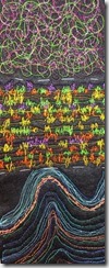
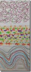
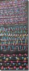
Module 1–Lesson 10: Stitching Colours, Line & Texture

Chapter 10: Stitching Colours, Line and Texture

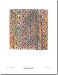
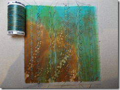
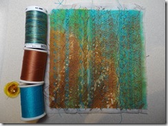
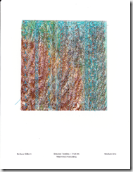
Mini Samples

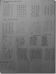
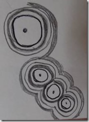
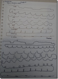
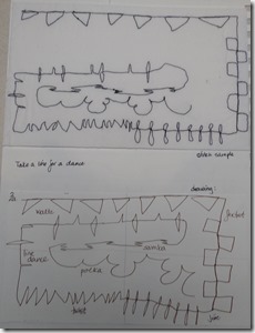
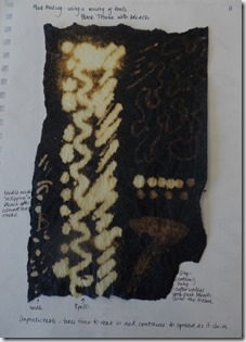
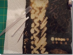
Stitch and a blob – doodles with lines and circles

clip_image002

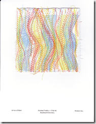
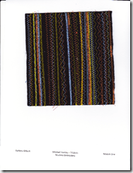
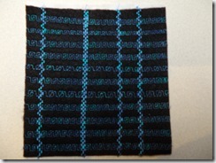
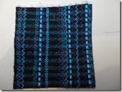
1. Stich in a line –

Fabric: black acrylic felt – one layer Fabric: cotton muslin

Stabilizer: black Pellon fabric: thin fleece batting

Foot: R – feed dogs lowered Foot: R – feed dogs lowered

Stitch width: 0 Stitch width: 0

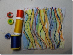
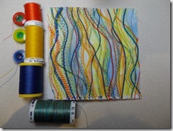
Generally the bobbin thread matched the upper thread. However some yellow lines did have an orange bobbin thread and that does make a difference in the overall appearance of the stitch.

clip_image004 clip_image006

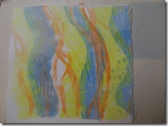
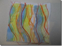
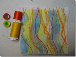
2. Stich in a circle, spiral, backwards and forwards –

Fabric: black acrylic felt – one layer Fabric: transfer painted polyester satin

Stabilizer: black Pellon fabric: thin fleece batting

Foot: R – feed dogs lowered Foot: R – feed dogs lowered

Stitch width: 0 Stitch width: 0

clip_image008 clip_image010

Thoughts on the process.

Sometimes the drawings look so distinct, but in translating them to stitch, some drawings begin to look the same.

Started with one colour and then added in a second colour. It got more exciting as I added a third colour. Had to concentrate on making such small blobs – making enough movement with the machine to have the blob show up as something, not just knot the threads underneath.

The results are more effective on the black felt than the white backgrounds. The transfer painted background is definitely more interesting than the muslin. I used the colours in the transfer paint to decide on colours to stitch with. I liked the addition of the metallic thread. I think the stitching on the transfer painted satin helps to integrate the painting into the fabric.

The line green/red-violet swirly circles/lines combination doesn’t really work for me. It is too confusing. It might work well if you had a very large, strong, definite design to apply on top of it. I think I like the line with a blob sample best.

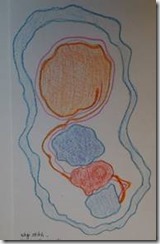
Lines and enclosed spaces:

clip_image012 à clip_image014 clip_image016

clip_image018 clip_image020 clip_image022

clip_image024 clip_image026 clip_image028

clip_image030 clip_image032 clip_image034

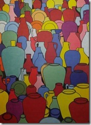
“Pottery” by Patrick Caulfield

clip_image036

The basic shapes in this piece are basically circles and ovals, with some added handles which are partial ovals. There are only very small glimpses of negative spaces that do not have any particular shape. The circles are mainly at the top of the picture.

The lines are all curves.

The colours used are solid; there is no shading. Each shape is outlined in a thin black line. Details are also formed with thin black lines. The background spaces are black. There is one white jug. The colours Patrick used include:

Yellow – two values

Purple – one value repeated three times

Blue – 4 values – dark, royal, medium and very pale

Bluey-green – 2 values – pale and darker green

Orange -2 values

Red – 4 values – burgundy, red, pink and pale pink

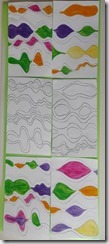
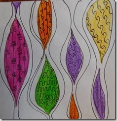
Lines and enclosed spaces, plus colour

clip_image038

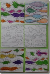
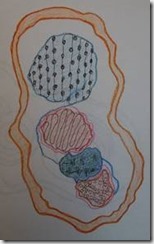
Lines and enclosed spaces plus colour and doodles

clip_image040

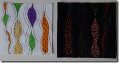
Lines and spaces and colour and machine doodles -A

Fabric: black acrylic felt

Stabilizer: black Pellon

Foot: R, feed dogs lowered

Stitch width: 0

clip_image042

Doodle for Design B

clip_image044

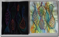
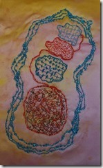
Lines and spaces and colour and machine doodles – B

Fabric: Black acrylic felt Fabric: transfer painted polyester satin

Stabilizer: Black Pellon + 4 thin layers tear away Stabilizer: 4 very thin layers tear away, + stitch’n’tear for pattern

Foot: R, feed dogs lowered Foot: R, feed dogs lowered

Stitch width: 0 Stitch width: 0

clip_image046

Colours are more dramatic on the transfer painted satin.

The stitches must be very dense to show up on the black felt. I need to use a high colour contrast for the design to be effective, especially on black felt.

Resolved sample.

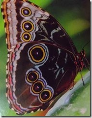
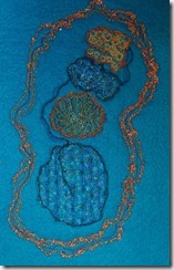
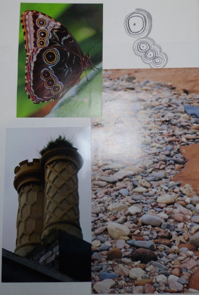
I took the design from the butterfly wing (chapter 7, page 2). I simplified the circles and then enlarged the design slightly to fit the 10 cm requirement.

clip_image048 clip_image050

clip_image052 clip_image054

I used a complementary colour scheme of orange and blue. I stitched the design twice using two different backgrounds – turquoise acrylic felt and a peachy pink transfer painted polyester satin fabric. I used mainly cotton threads in varying weights and YLI Candlelight metallic thread for the cable stitched outer lines.

(My trusty Husqvarna sewing machine died in the middle of this part of the exercise and so it had to wait till I decided what machine to purchase and then recover from knee replacement surgery and learn how to use my new machine before I could finish the lesson.)

I forgot that placing the drawing of the design on the reverse side to stitch through – without first reversing the drawing- gives you a mirror image of the design!

When I thought I was finished, I realized that I could not see any connection between the blobs, so I went back and added in the cable outlines for the inner enclosed spaces.

I am quite pleased with the results.

clip_image056 clip_image058

C&G Machine Embroidery- Module 1 Lesson 9: Playing with Colours, Building Layers


IMGP3469

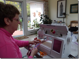
Here I am – playing with my machine at Diana’s!

Page 1- Playing with primaries – building layers

  • Fabric: Muslin (calico)
  • Stabilizer: white felt (polyester – lightweight)
  • Foot: B (clear zigzag)
  • Stitch length: 0.5
  • Stitch width: varied
  • Feed Dogs: up
  • Threads: sewing cottons with matching bobbin colour

IMGP5761 (3)

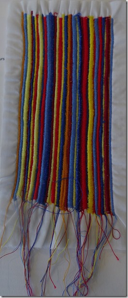
My sample was too long – it took forever to stitch it!!!! The sample shrunk width wise. The colours are very vibrant – not relaxing at all. I used two values of each of the primaries. The wider rows of yellow zigzag seem to dominate or pop out. Once I added the yellow-orange rows, I think the piece looks more thoughtful or pulled together, not just a child’s primary colour exercise. The dark value of the red – burgundy- also helps to soften the primary colour combination. I like the look of the thread tails at one end only.

When you are stitching over a previous row – or half of a previous row, it was sometimes difficult to control the smoothness of the line. You get a look of poor tension where the colour contrast is great because the zig is showing up so much – but my tension was correct.

Page 2 – Playing with Primaries – building layers – automatic patterns

  • Fabric: bleached muslin
  • Stabilizer: white felt
  • Foot: B (clear zigzag)
  • Stitch length: varies
  • Stitch width: varies
  • Stitch pattern: D 8
  • Feed dogs: up
  • Thread: sewing threads with matching bobbin threads

IMGP5762 (2)

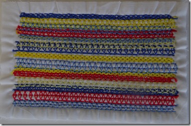
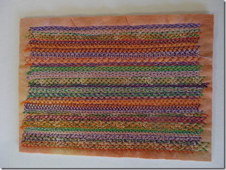
I changed my sample size – stitched 5 samples on one piece of cloth, then cut them to size. There is not as much shrinkage on the smaller samples, [perhaps because they are smaller and/or perhaps because the patterns are not as dense as simple zigzagging.

I find this sample much more interesting. I used the same yellow and blue threads (two tonal values of each) and only the bright red. (I did not use the burgundy nor the yellow-orange.) Changing the length and width of the stitch gives many more values to the piece. Using only the zigzag stitch gives a very solid look, whereas the patterns allow the fabric background to peek through.

Page 3- Experimenting with secondary colours

  • Fabric: hand dyed cotton
  • Stabilizer: white felt
  • Foot: B (clear zigzag)
  • Stitch length: 4
  • Stitch width: 6
  • Stitch pattern: E 14
  • Feed dogs: up
  • Thread: sewing threads with matching bobbin threads

IMGP5763

Using a fabric dyed in one of the secondary colours greatly enhances this exercise. I can see more use for this technique to create textured backgrounds. The colours seem to melt into the background, not stand out “in your face” as do my primary samples on muslin.

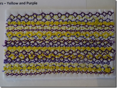
Page 4- Building layers with Primary and complementary colours – Yellow and Purple

  • Fabric: bleached muslin
  • Stabilizer: white felt
  • Foot: B (clear zigzag)
  • Stitch length: varies
  • Stitch width: varies
  • Stitch pattern: E 15
  • Feed dogs: up
  • Thread: sewing thread and matching bobbin thread

IMGP5764

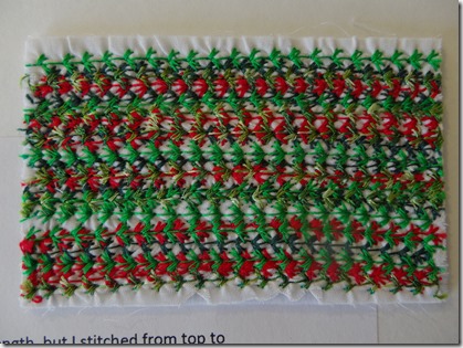
 Red and Green

  • Fabric: bleached muslin
  • Stabilizer: white felt
  • Foot: B (clear zigzag)
  • Stitch length:
  • Stitch width:
  • Stitch pattern: E 36
  • Feed dogs: up
  • Thread: sewing thread with matching bobbin thread

IMGP5765

For this sample, I did not vary the stitch width and length, but I stitched from top to bottom and bottom to top. (For all previous samples, I had been stitching only top to bottom.) As this is a directional pattern, this does show slightly. I also used a variegated green/yellow-green shiny thread.

 Blue and Orange

  • Fabric: bleached muslin
  • Stabilizer: white felt
  • Foot: B (clear zigzag)
  • Stitch length: varies
  • Stitch width: varies
  • Stitch pattern: E 34
  • Feed dogs: up
  • Thread: sewing thread with matching bobbin thread

IMGP5766

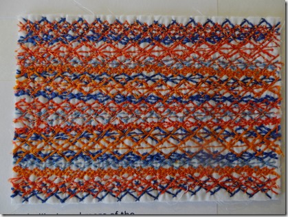
This sample should really be called Orange and Blue as it looks like I used more of the secondary colour than the primary! But on counting the rows, I have only one more row of orange than blue – show that orange grabs your attention more than blue.

Using the complements in this manner seems a deliberate forcing of a colour scheme. Perhaps if the colours chosen were more subtle or closer in value, this technique would be a good background technique. I did like doing the exercise. It is more subtle to use a background colour of one of the colours used in the stitching. 


Page 5 – More experimenting – Blue and Orange – 2 samples

  • Fabric: bleached muslin and hand dyed cotton
  • Stabilizer: white felt
  • Foot: B (clear zigzag)
  • Stitch length: varies
  • Stitch width: 9
  • Stitch pattern: E 9
  • Feed dogs: up
  • Thread: sewing threads and matching bobbin threads


   IMGP5767  

IMGP5768

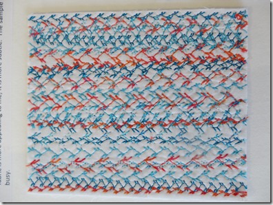
I stitched this sample on two different backgrounds – same threads and same stitches, varying stitching direction top to bottom and bottom to top. The sample on the orange dyed fabric is more appealing to me; it is more subtle. The sample on the white background looks too busy.

Page 6 – more experimenting

  • Fabric: hand dyed cotton
  • Stabilizer: white felt
  • Foot: B (clear zigzag)
  • Stitch length:
  • Stitch width:
  • Pattern: E 56
  • Feed dogs: up
  • Thread: sewing threads and metallic gold with matching bobbin threads

IMGP5769 (2)

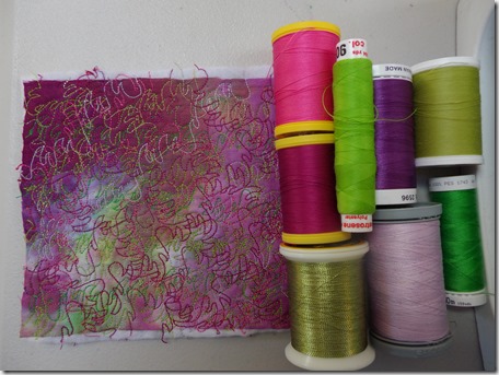
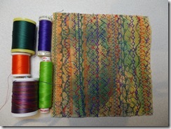
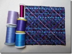
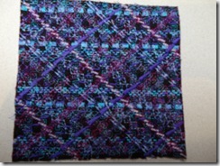
I sewed this sample using the colours found in the hand dyed fabric – two tonal values of green and purple, with a metallic gold for accent. One of the greens was a variegated thread. I stitched the pattern diagonally – right to left and left to right, rather than straight vertical or horizontal lines. I like this effect very much and can definitely see this as valuable for a background. I think this sample does have a razzle dazzle!

IMGP4664

These are the threads I used to stitch this sample.


Page 7 – Colour grading – Tonal Values

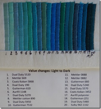
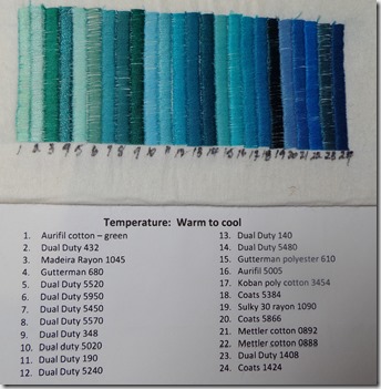
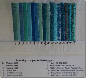
I have used the blue-green colour range to do this exercise.  I have made three arrangements and stitched a zigzag column of each colour to show value change – light to dark, temperature change – warm to cool, and intensity change – dull to bright. 

IMGP5740 (2) 

IMGP5230 

IMGP5741 (3)


Page 8 – Monet’s Colours

Monet is my very favourite artist! I was very fortunate to visit Paris and Giverney last fall.  I dragged my husband all over Paris ti look at the paintings of the impressionists.  And I have many photographs of Monet’s Gardens at Giverney.

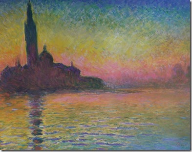
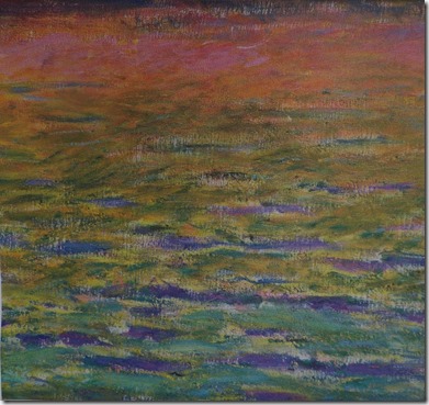
The painting I have chosen is one of Monet’s of  San Giorgio Maggiore, painted in 1908.  The colours I can see in the water section I have chosen include:  navy blue, pale pink, peach, orange, yellow, yellow-green, greyed yellow-green, green, blue-green, aqua, pale royal blue, blue-violet, pale violet.  I have included the section of the water that I used as my inspiration.

IMGP5737 (2) 

IMGP5739 (2)


Page 9 – Water colour rendition of the water

IMGP5743 (2)

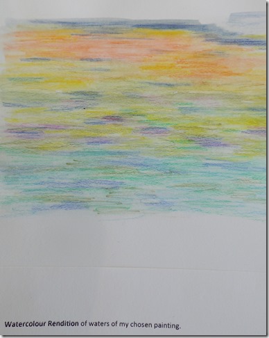
I used Derwent Inktense watercolour pencils to create this “painting”.


Page 10 – Water Reflections A

  • Fabric: black felt
  • Stabilizer: 4 layers Armo intra face #6140
  • Foot: open toe darning foot
  • Stitch length: 0
  • Stitch width: 6
  • Pattern: free motion zigzag, not in a hoop
  • Feed dogs: down
  • Thread: sewing thread with matching bobbin threads


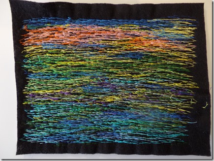
IMGP5770

I stitched my design from the top down and then went back to fill in areas I had missed and any highlights. I have puckering vertically – I was moving my felt side to side as I stitched to give the effect of water.  I like the dark shadows the black felt gives.


Page 11 – Water Reflections B

  • Fabric: transfer painted
  • Stabilizer: white felt
  • Foot: open toe darning foot
  • Stitch length: 0
  • Stitch width: 6
  • Pattern: free motion zigzag with no hoop
  • Feed dogs: down
  • Thread: sewing threads with matching bobbin threads –using primary and secondary colours, black and white and two threads in the needle

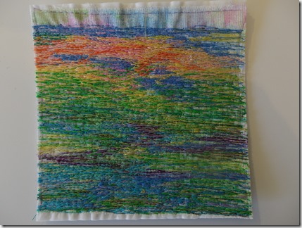
IMGP5771 

I was fighting the transfer painted background colours a bit as this piece was not painted for this particular sample – just one of the pieces I had done previously. I think it could have been better if I had actually painted a background for the piece.  I did not stitch in any black shadows, and viewing this on the computer, makes me realize that I do actually neeed some darker spots.


Page 12 -Water Reflections C

Challenge: using primary colours, secondary colours, black and white


  • Fabric: transfer painted polyester
  • Stabilizer: 4 layers stitch & tear
  • Foot: open toe darning foot
  • Stitch length: 0
  • Stitch width: 6
  • Pattern: free motion zigzag, not in a hoop
  • Feed dogs: down
  • Thread: sewing thread with white bobbin threads: Red, Yellow, Blue, White Purple, Orange and Green. and using two threads through the needle.

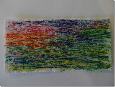
IMGP5772


I stitched this sample from memory of the previous two and of the colour rendition. I had forgotten to bring these out to Diana’s the day I stitched the sample.  I also used up the leftover piece of the transfer painted fabric for this sample, so it is a bit smaller than the other two.  I think it is pretty good, having done it from memory


I have photos of the step by step process of stitching this assignment.

IMGP5448 (2)      IMGP5450

IMGP5451 (2)         IMGP5452 (2)

IMGP5453 (2)         IMGP5454 (2)

IMGP5455 (2)        IMGP5456 (2)

IMGP5457 (2)

C&G Machine Embroidery- Module 1 Chapter 8 –Take a Line for a Walk


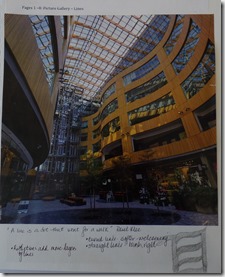
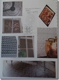
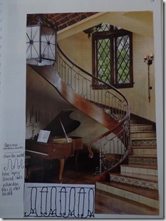
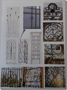
Pages 1 –8: Picture Gallery – Lines

As the magnet on my fridge says: “A line is a dot that went for a walk”. Paul Klee is the artist credited with this.

When do lines become forms?

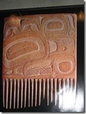
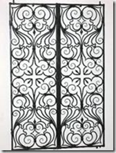
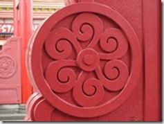
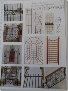
I am drawn to curving lines – curlicues, wrought iron works – I have many more photos of these!

I had the trellis pictures from a garden magazine because I want my husband to build a new trellis for my poor climbing rose.


  IMGP5748 (2)           IMGP5749 (2)


IMGP5750 (2)      IMGP5751 (2)


IMGP5752 (2)      IMGP5753 (2)


IMGP5754 (3)       IMGP5755 (2)

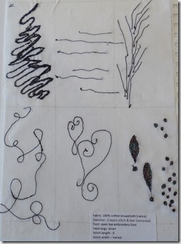
Page 9: Take a Line for a Walk – drawing and stitch sample

  • Fabric: 100% cotton broadcloth (calico)
  • Stabilizer: 2 layers stitch & tear
  • Foot: open toe embroidery foot with hoop
  • Feed dogs: down
  • Stitch length – 0
  • Stitch width – 0

IMGP5286

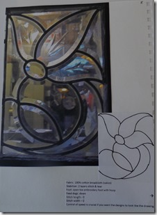
Control of speed is crucial if you want the designs to look like the drawing.  I can see that I need to work on spacing if I am sewing continuously.


Page 10: Take a Line for a Dance – drawing and stitch sample

  • Fabric: 100 % cotton broadcloth (calico)
  • Stabilizer: 2 layers stitch & tear
  • Foot: open toe embroidery foot with hoop
  • Feed dogs: down
  • Stitch length – 0
  • Stitch width – 0

IMGP5287

Spacing of the rows is a bit better, but still needs work.


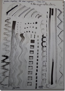
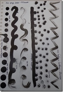
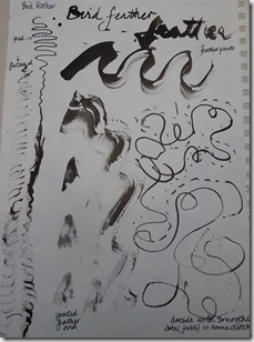
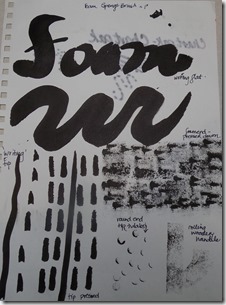
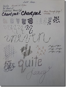
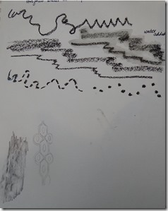
Pages 11 – 18: Mark Making using various tools and black “ink”

 IMGP5756 (2)      IMGP5734


IMGP5276      IMGP5277


IMGP5278      IMGP5279


IMGP5280      IMGP5281


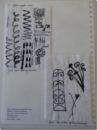
Page 19: Line Stitch Samples

Two small samples, the first from lines on the mark making pages and the second from drawings from the picture gallery pages.

  • Fabric: 100% cotton broadcloth (calico)
  • Stabilizer: 2 layers stitch & tear
  • Foot: open toe embroidery foot
  • Feed dogs: down
  • Stitch length – 0
  • Stitch width – varied

IMGP5757

I enjoyed the design interpretations more than just copying lines.


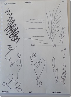
Page 20: Emotions – drawing

I think your drawings represent happiness, excitement and agitation.

IMGP5758 (2) 


Page 21: Emotions – stitch samples

  • Fabric: 100% cotton broadcloth (calico)
  • Stabilizer: 2 layers stitch & tear (removed)
  • Foot: open toe embroidery foot
  • Feed dogs: down
  • Stitch length – 0
  • Stitch width – Varied

IMGP5759 (2)

The black cotton thread left a lot of lint on this fabric. 

I did use a metallic black variegated thread for the excitement box to add a little sparkle

C & G Machine Embroidery – Module 1: Chapter 7 – Free Embroidery


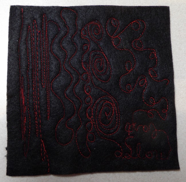
1.       Stitching Doodles – straight stitching

Fabric: black felt

Stabilizer: black felt

Foot: open toe darning

Feed dogs: down

Stitch length – 0

Stitch width – 0

Thread:  red cotton. Black bobbin thread

Image

Stitching straight lines, curves, circles, spirals and swirls.  I have more control of stitch length if I sew fast and move the fabric at a consistent speed.  This is the challenge!  The red thread disappears into the black felt.  It shows up more in the photo than in actuality.

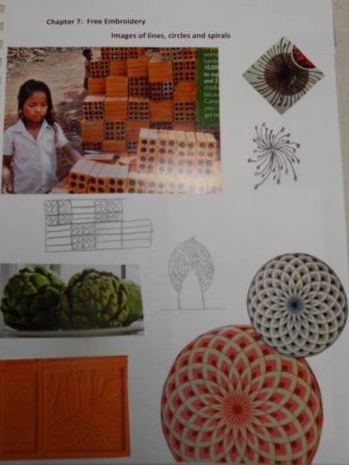
Photos of circles and curves

Image

Image

Image

Image

I love the movement in this adImage

 Image

Image

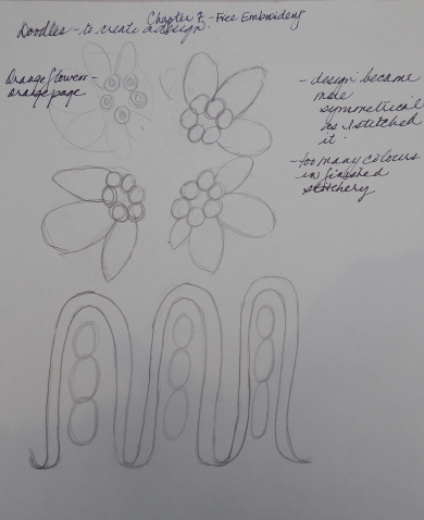
I used the orange flower from the orange page in lesson 1 as a design source


2. Stitching a Circle design – straight stitching.

Fabric: black felt

Stabilizer: black felt

Foot: open toe darning

Feed dogs: down

Stitch length – 0

Stitch width – 0

Thread – sewing cottons and polyesters.  Black bobbin thread

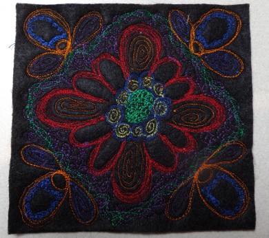
Image

The primary colours are in the center of the design.  The red is the strongest, the yellow almost disappears and the blue around the yellow is just a shadow.  I added the complementary colours to the stitching in the corners.  The design became much more symmetrical than the orange flowers that were the design source.  It became a pattern rather than a representation of the flowers, especially with all the colour changes. To make the colours visible on the black felt, I found I needed to go over the lines of stitching several times

The stitched results are too busy for my taste, but I rather like the design.


3. Stitching a Circle design – zigzag stitching.

Fabric: black felt

Stabilizer: black felt

Foot: open toe darning

Feed dogs: down

Stitch length – 0

Stitch width – varied depending on the effect I wanted

Thread – # 30 cotton with matching bobbin thread colours

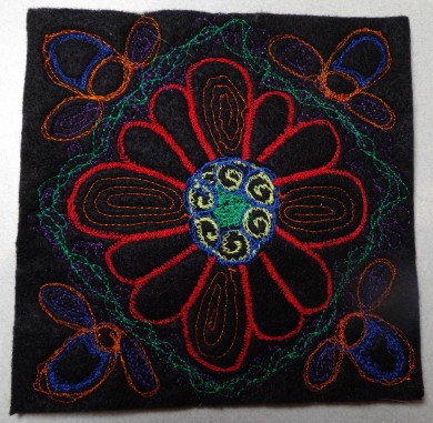
Image

The thread colours show up more when the stitch has a width, but I had to sew slower to get an even coverage of the zigzag.  To make the spirals, I had to use move the fabric sideways to achieve the slightly wiggly line.  I like the colour impact of this sample, but the delicacy of the straight stitching sample.


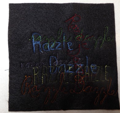
 4. Using free embroidery and straight stitch without a frame – “razzle dazzle”

Fabric: black felt

Stabilizer: black felt

Foot: open toe darning

Feed dogs: down

Stitch length – 0

Stitch width – 0

Thread – sewing cottons and polyesters.  Black bobbin thread

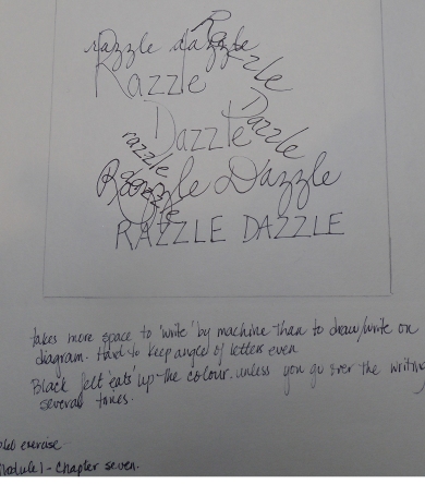
 Image

Image


My drawing is much more centered than the stitching.  I have not judged the distance very well.  I can write more tightly than I can stitch!  I stitched the blue four times in order to get the colour to show through.  The purple almost disappears.  The colours fade into the black felt.

I can see that if I am doing free motion lettering, I would need to practice or warm up first on scrap fabric before I tackle the lettering on my project.


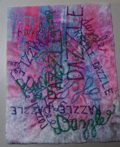
 5. Using zigzag stitch and free embroidery in a frame – “razzle dazzle”.

Fabric: white stretch velvet – transfer painted

Stabilizer: 4 layers Armo-intra face #6140

Foot: open toe darning

Feed dogs: down

Stitch length – 0

Stitch width – 3.5

Thread – Rayons and polyesters.  White or matching bobbin thread

Image

I had a large piece of the velvet (8 ½” x 11”) and just kept moving the hoop to fit more words in – so my sample ended up quite large!  My letters are quite large.   I used the pinks and blues as thread colours with some green threads for accent. 

Zigzag stitches give a greater impact than straight stitching if you want a design to have a good impact. 


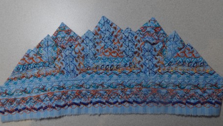
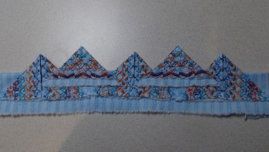
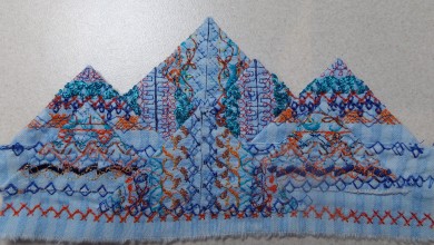
Chapter 6: Prairie Points with a Purpose


Fabric:  100% cotton print – pale blue with blue stripe

Stabilizer: none – just fabric folded in half

Foot: B (regular zigzag)

Stitch length: varies with pattern chosen

Stitch width: varies with pattern

Threads:  sewing threads


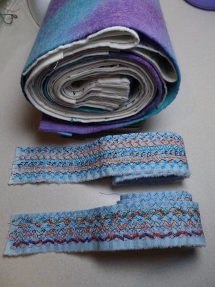
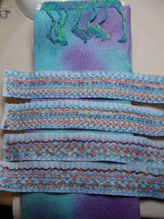
I chose a complementary colour scheme of blue and orange.  I used cotton threads in different values of blue and orange.  Sometimes the bobbin matched and sometimes not.


For the first sample, I covered the raw edges by placing the prairie points behind the base strip and behind each other.  The sample seems to curve slightly, probably because of the weight of the folded pieces.

For the second sample I placed the prairie points on top of the base strip so that the raw edges remain visible.Image

For the third sample, I stitched another strip to use the base strip and to include it in the structure.  On one row of the stitch patterns, I used a pearl cotton to do a cable stitch.  The pattern is obliterated on the pearl cotton side, but has a wonderful texture and sheen.   I have some points with the raw edges showing and others not.  I sewed the second row together first and then attached that to the very top edge of the base strip with a patterned stitch.  Then I attached the front three triangles below that on the base strip. I covered the raw edges of these three triangles with a stitch pattern.  This was an easier method of keeping the strip straighter.Image

I have used regular folded fabric prairie points along the edges of a baby quilt and several small wall hangings.  It does add considerable weight to a project and bulk to the edge of a quilt.  When using folded fabric (not machine decorated) prairie points, I like to interlock the prairie points with each other.

Image


Image


Image


Image


Image


Image


Resolved sample – “Triangle Dangle”

Image

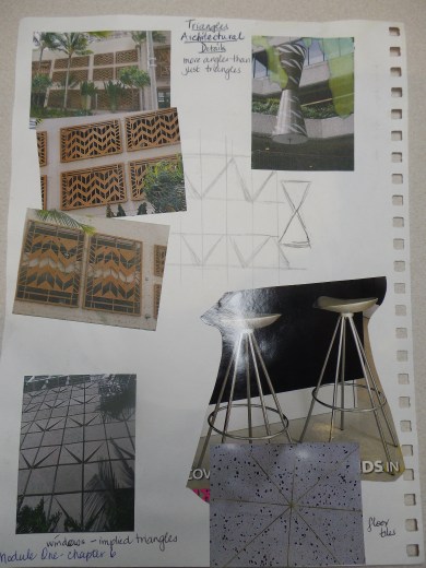
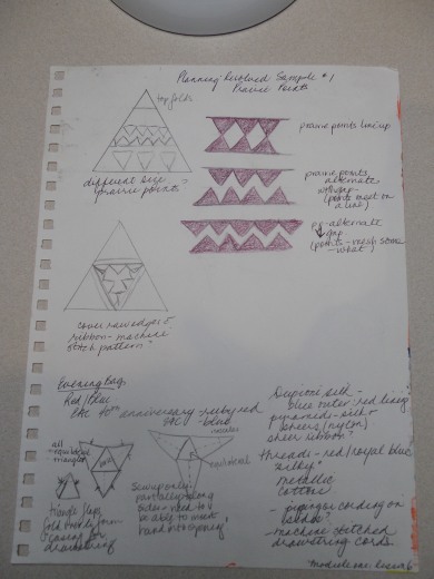
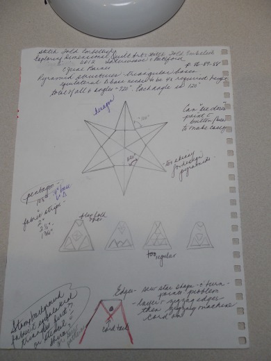
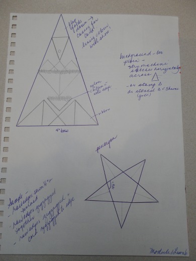
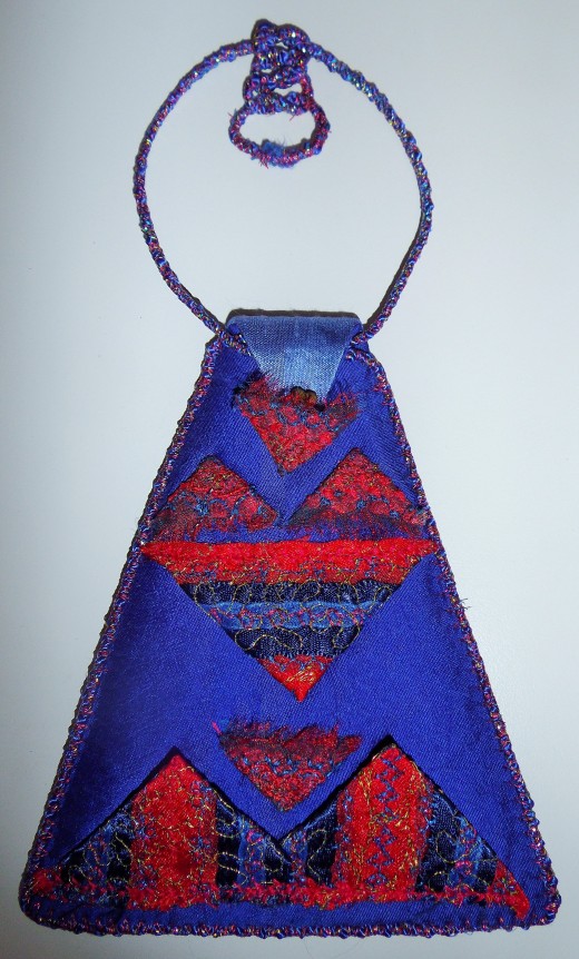
I decided that I wanted to do this design to fit a triangle shape to echo the prairie point shape.   The design idea came while I was browsing through a book called “Exploring Dimensional Quilt Art” by C. June Barnes.  On pages 86-88, she shows how to make containers from triangles.   This year (2013) is the 40th anniversary of the Embroiderers’ Association of Canada and I wanted to make an evening bag to complement the royal blue dress I was wearing to the banquet at our annual Seminar, and so I thought this would be the perfect solution to two problems.  I chose the colour scheme of red – for the ruby anniversary of the association – and royal blue – the EAC colour.  I added gold accents as this was to be a “party” bag.

I drew out patterns for a 3-sided triangle bag, but felt that the opening would end up too narrow for the base size I wanted (four inches).  Next I drew hexagon bag, but the sides would be too narrow to fit very many prairie points in a design. After looking up the angles for a pentagon, I settled on a pentagon design with a base pentagon of 4 inches along each side.  I made paper prairie points in four different sizes and played with design placement on the triangle.

Image


Image


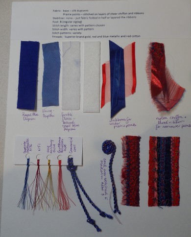
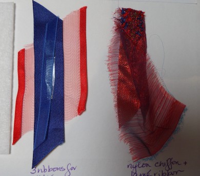
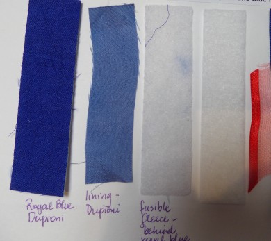
As this was to be an evening bag, I decide to use shiny or “glamorous” fabrics.  I chose dupionni silk for the actual bag sides and made the fabric for the prairie points using satin and chiffon ribbons and sheer nylon chiffon.   For the wider points I used three ribbons in varying widths and for the very narrow points, I used a strip of torn nylon chiffon folded in half with a red lame ribbon inside.  The chiffon has a very interesting texture as the edges frayed nicely where they were torn.  The ribbon layers had finished edges, so did not fray much.

Image

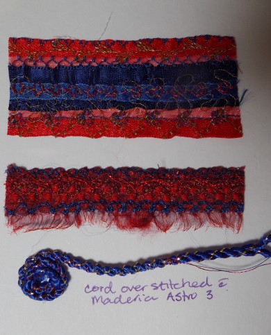
The outer edge of the triangle dangle is finished with a narrow, commercial cord that has been overstitched with a zigzag in metallic thread before zigzagging the cord onto the edge.

Image

ribbons and fabric used


Image

background and lining fabric and stabilizers


Image

samples of stitched strips and cord


Image

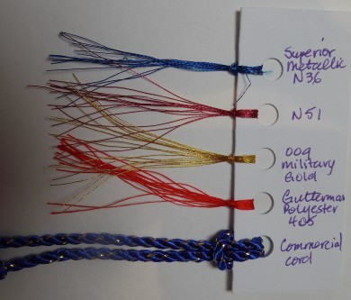
threads used


In the end, I have not constructed the bag, but made one side into a “triangle dangle”. And have a ton of stitched ribbon ready to make a bag!  This is my sampling for a future bag!!


Fabric:  base – silk dupionni

                Prairie points – stitched on layers of sheer chiffon and ribbons

Stabilizer: none – just fabric folded in half or layered the ribbons

Foot: B (regular zigzag)

Stitch length: varies with pattern chosen

Stitch width: varies with pattern

Stitch patterns: variety

Threads:  Superior brand gold, red and blue metallic and red cotton

Image

triangle dangle

C&G Machine Embroidery Module 1–Chapter 5: Stitching Colours

Chapter 5: Stitching Colours

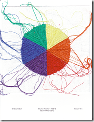
1. Stitching a colour circle with six colours of thread

Fabric: drapery lining

Stabilizer: 3 layers Armo 6140

Stitch pattern: F5

Foot: B (regular zigzag)

Stitch length: 0.4

Stitch width: 6 (generally!)

Thread: Aurifil cotton – MAKO NE 28/2

Bobbin – polyester – sewing thread in matching colour

I like the thread tails left on! I tried to reduce the zigzag width as it neared the center of the circle, but did not like the effect of the “joins”, so at the completion of each colour, I did a final row down the center. I did leave the red, violet and blue as they were stitched. I got a small pucker forming in the center, but it disappeared when I ironed the sample.

The primary colours are red, yellow and blue. The secondary colours are made by mixing equal amounts of two primaries: orange, green and violet. The tertiary colours are made by mixing one primary with the adjacent secondary: Red-orange, Yellow-orange, Yellow-green, Blue-green, Blue- violet, Red-violet.

image

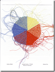
2. Stitching a Colour Circle with the three primary colours of thread

Fabric: drapery lining

Stabilizer: 2 layers Armo 6140

Foot: B (regular zigzag)

Stitch Pattern: F5

Stitch length: 0.4

Stitch width: 6

Threads: 50 wt sewing threads

Bobbin threads: matched the primaries and used orange, green and violet for the appropriate secondary.

My machine did not like to stitch with the two threads of the heavier weight that I used for the stitching the first colour circle, so I switched back to regular sewing thread. The orange was a successful mix and the violet isn’t too bad if you squint, but the green is not green!

This would work better if you used two values of the three primaries as the thread is coloured with dyes not pigments.

image

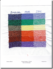
3. Tonal Value with thread

Fabric: drapery lining

Stabilizer: 2 layers Armo 6140

Foot: B (regular zigzag)

Stitch Pattern: F5

Stitch length: 0.4

Stitch width: 6

Threads: 50 wt sewing threads

Bobbin threads: matched the colour sewing

I actually stitched this exercise at the same time as doing the second colour circle as there seemed to be less threading that way. The sample was stitched sideways and shrunk in that direction slightly. Thank you for reminding me that my machine does have built in alphabets and that I could use one for a label!

image

4. Tonal Value with Paint

a. Tints – adding white to the hue

b. Shades – adding black to the hue

Tones – adding grey to the hue

image

5. Painting a six colour circle with tints and shades.

Achieving a good violet or green depends so much on the hue you start with!

image

6. Painting a twelve colour circle with tints and shades.

I made the outer circle the shades – very dull!!. I wish I had made the outer circle the tints.

image

C&G Machine Embroidery Module 1–Chapter Four: Zigzag Stitch and Automatic Patterns

Chapter 4: Zigzag Stitch and Automatic Patterns

1. Changing Stitch Width:

Fabric: polyester crepe

Stabilizer: white felt

Foot: B (regular zigzag)

Stitch length: 3

Stitch width: 0.5 – 6

Threads: yellow, orange and blue

Rather than strictly straight lines, I stitched in a curve, following the lines of the transfer paint design. I found it difficult to change widths as I was sewing as I had to push the buttons for every change and switching from watching the curve to the button setting on the computer screen was a bit complicated. Even though the yellow thread was the brightest of the three colours, it has almost disappeared into the fabric. The completed sample barely shrank at all.

image

2. Changing stitch length:

Fabric: black felt

Stabilizer: 2 layers “do sew” (old pattern tracing material – perhaps Lutrador?)

Foot: B (regular zigzag)

Stitch length: 0.5 – 6

Stitch width: 4.5

Thread: same threads as sample 1 – yellow, orange and blue

The black background certainly gives a “bounce” to the thread colours compared to the pale background of the first sample. I only did a few changes in width as I stitched the lines. Some straight lines are not very straight!

image

3. Experiment – changing stitch length and length

Fabric: polyester crepe – transfer painted, same design as sample 1

Stabilizer: 2 layers Armo 6140

Foot: B (regular zigzag)

Stitch length: 0.5 – 6

Stitch width: 0.5 – 6

Thread colours: yellow and orange – same as sample one, blue – darker and then 8 rows of a shiny polyester variegated thread on top.

It is much more interesting to see the width and length changing throughout the sample. The yellow colour shows up on this sample when it is a “satin” stitch.

IMGP3113IMGP3114IMGP3115IMGP3116

IMGP3117

image

4. Automatic patterns – changing stitch width and length on some of the patterns

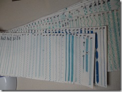
My sewing machine will be 13 years old this May. It is a Husqvarna Designer 1 and so has many built in automatic stitches. Two years ago, I actually sat down and stitched out a 6 inch length of every one of the patterns onto a felt like stabilizer; it took me 14 hours to do this. There are 14 “menus” for the stitches, so each menu has its own page of stitches. To make these pages into a useful resource, I hand stitched the 14 pages together along one edge to create a spine and then gave my book a cover. That was another 14 hours of hand stitching!! So now my rolled book is my stitch reference. It was very valuable to do this as some of the stitches look quite ugly in their drawings, but stitch out beautifully. I do find it difficult to change width and length as I am stitching as I have push buttons not a dial for changing settings. I tended to change the given settings and stitch the pattern in a smaller size than the programmed one, rather than changing as I sew.

a. Fabric: bridal satin, transfer painted (pinks and blue)

Stabilizer: white felt

Foot: B (regular zigzag)

Stitch length: 0.5 -6

Stitch width: 0.5 – 6

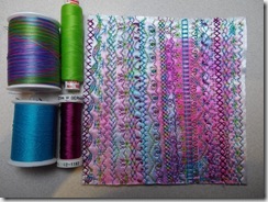
Threads: Variegated polyester (Signature size 30 –tropical brights), red violet Sulky rayon, turquoise and lime green

I used 505 spray to “attach” the satin to the felt before I started stitching. Much more control as the satin did not go its own way. Started with the variegated thread and built my colour scheme from that. Some of my lines are not very parallel! I used the D menu for all the patterns on this piece.

IMGP3118

image

b. Fabric: hand dyed and batiked Kona cotton and transfer paint overdyed

Stabilizer: 5 layers nappy liners

Foot: B (regular zigzag), S foot for the extra wide stitches

Stitch length: 0.5 – 6

Stitch width: 0.5 – 9.0

Threads: lime green, dark green, purple, orange and Sulky 12 wt variegated 713-4054

I used menu E for the stitches on this sample. I have a stitch that imitates free motion stippling on this menu, so that is a very nice stitch to integrate the patterns. The fabric was quite ugly and bland before I started the stitching; it is much more interesting now.

IMGP3120IMGP3121

IMGP3122

image

c. Fabric: batik and hand dyed Kona cotton

Stabilizer: 2 layers Armo 6140

Foot: B (regular zigzag), S foot for the extra wide stitches

Stitch length: 0.5 – 6

Stitch width: 0.5 – 9

Threads: Mettler polysheen variegated #40 – 9978, turquoise, two shades of pale brown and a copper metallic thread.

Once again, this was not an inspiring piece of fabric, although it did have some small white circular designs from the batik – rather bubble like. So I chose patterns from menu L and menu N that had curves and circles to complement the bubbles. I drew soap lines to give myself a better guideline for straight rows – and it helped somewhat. I chose to keep the colour scheme somewhat subdued as if looking underwater at the sea weeds and bubbles. I do like the copper glints.

IMGP3123IMGP3124

image

d. Fabric: black felt

Stabilizer: 3 layers nappy liners

Foot: B (regular zigzag)

Stitch length: 3 – 6

Stitch width: 2.5 – 6

Thread: Sulky 30 wt blendables– 733-4083, two shades of pale mauve, a purple and a red- violet.

My brain was getting tired as I stitched this last sample, so all I could think of was a geometric design. I used several menus for this sample as I was looking for geometric patterns. The first two layers were stitched with the Sulky thread. The first layer of stitching was the Greek key pattern with some variation in width and length of the stitches in some of the rows. At right angles to that is the second layer of stitches with more solid geometric patterns. The third row was stitched on the diagonal using diagonal type stitches. I used the two shades of pale mauve for this. The fourth row is the diagonal in the opposite direction using the purple and red violet. It is interesting to note how much more impact the solid satin stitch patterns have. This sample does have lots of texture for a background grid.

IMGP3125 IMGP3126

IMGP3127IMGP3128

image


My sewing machine stitch dictionary!

IMGP3133IMGP3130

IMGP3129

It took me 14 hours to stitch out a 6 inch length of all the built in stitches on my machine…… and another 14 hours to hand stitch the binding that holds the “pages” together.   but it is a great reference as the stitches look so much different when they are stitched compared to the drawing in the instruction book.

C&F Machine Embroidery Module 1 Chapter three

Chapter 3: Straight Stitching

1. Grid sewn with foot on

Fabric: bridal satin

Stabilizer: 3 layers nappy liners

Foot: B (regular zigzag)

Stitch length – 3

Stitch width – 0

The satin did pucker up where not stitched and shrink slightly in overall size. I used orange, purple and very pale green threads.

image

2. Diagonal grid

Fabric: black felt

Stabilizer: black felt

Foot: B

Stitch length – 3

Stitch width – 0

There was less shrinkage with this sample. I used green, orange and pale mauve threads.

image

3. Straight lines all over

Fabric: muslin (calico)

Stabilizer: 1 layer of grey upholstery dust cloth

Foot: B

Stitch length – 3

Stitch width – 0

The mishmash of straight lines all over the fabric square in every direction was not very pretty – just looked like a jumble of conflicting coloured lines. I over stitched dark lines with navy blue thread.

The dark lines do give the background a sense of unity and perhaps a purpose. It looks to me like fireworks in the sky with wires (or some man-made object) lit up against the bright lights in the sky.

image

4. Straight lines all over on a coloured surface

Fabric: transfer painted bridal satin

Stabilizer: 2 layers of Armo 6140 interfacing

Foot: B

Stitch length – 3

Stitch width – 0

The satin moved as I started the straight stitching, so I tried sewing around the perimeter to stabilize the fabric. In the end, I got some pucker/tucks on one side of the design as the satin gathered up to the sewing outline. (Note to self: use the 505 spray to attach the top fabric to the stabilizer.)

I like the results I got with this sample. I sewed the straight lines as curves, sewing from one side to the other side. This fabric looked like a garden to me and I really wanted to do some free motion curls and circles to imitate the foliage better, but I resisted. I made the dark shapes curve slightly to give the effect of trees.

image

C&G Machine Embroidery Module 1 Chapter 2

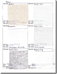
Collection of materials for machine embroidery:

Fabrics – see chart. I shop here in Victoria and in Vancouver: Gala Fabrics, Fabricland, Dressew, Fabricana, N. Jefferson’s Notions. I occasionally get to shop at JoAnn’s in Bellingham. I also order online from “Stitches” on Salt Spring Island.

image

image

image

image

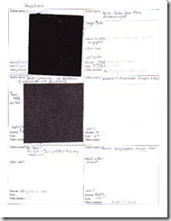
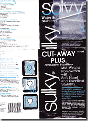
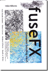
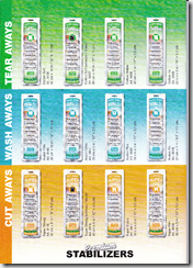
Stabilizers – see chart. These are generally purchased from shops around Victoria. I picked up a sampler package of 12 Madeira Premium stabilizers (Starter set Art.9449) at the wholesalers in Vancouver last month so have included a swatch of these too.

image

image

image

image

image

image

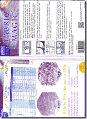
Nappy liners are nonexistent here in Canada. They were around 32 years ago when my daughter was young. I do have one roll purchased from Sears in 2007 and one package purchased from Boots in 2007 when I was over in England on a textile tour with Gail Harker. I shared some of these two nappy liners with Diana and Pat. Nappy liners melt when ironed.

I was able to purchase – for each of us – a bolt of Armo “Intra-Face Bias Featherweight” interfacing, style # 6140 for only $7.00 for the whole bolt. It is 50% rayon and 50% polyester. It does not melt when ironed. It is relatively lightweight, but I have used it double for several of the samples and do like it. It can be ironed.

I do have several water soluble stabilizers as well.

image

image

image

Threads – I have a variety of machine embroidery threads from cotton to rayon to polyester. They have been bought over the years from local sewing shops. There is an online shop on Vancouver Island called “Cindy’s Threadworks” that specializes in sewing threads. She carries the Superior brand of machine threads and the Superior machine needles. I use plastic boxes designed for fishing tackle to store my threads in colour families.

Needles – I generally use Schmetz needles for most of my sewing. I have just recently purchased the Schmetz double eye needles and the new Embroidery Gold needles. I have also been using “Superior” brand topstitch needles; they are made by Organ, a Japanese company. . They have a titanium coating and the point seems to last longer so they break less often. Madeira brand needles are not sold in Canada.

C & G Machine Embroidery Module 1 Chapter 1

Chapter 1: Collecting Colour

1. Colour Search

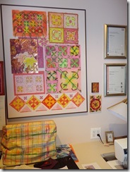
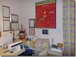
As I sit in my studio I see one wall of variations of orange, brown, and a cabinet top with a rainbow of colours and my work table topped with green. The rest of the room is a mishmash of colours: books bound in every colour; the pale ash wood of the cupboard doors; the wall of windows with a garden view; the woven baskets, plastic bins and tote boxes filled with fabrics and projects and of course, Chester, the cat, trying to be front and center in the way.

The oranges are from my design board of lilies; they range from intense to pale in an analogous colour harmony: yellow, yellow-orange, to orange to red-orange to red – pink to burgundy. The wall – the background surrounding the design board -is peach, a soft tint of orange; “Winthrop peach” according to the paint colour name! The lily designs on the design board are bold, brighter and stand out against the pastel wall colour. The paper designs have been created from painted papers – blending yellows and reds to create new oranges. The shiny copper sheet – another variation of orange – with the embossed lily design and my coloured pencil drawings of two lilies is a strong contrast to the matt surface of the rest of the board. There are slight lime green accents implying the greenery amongst the lilies.

And beside the massive design board are two very small acrylic paintings done by the aboriginal women near Alice Springs, Australia. They continue the orange them, pale to dark, with added black accents. The orange varies again from red –orange through orange to yellow-orange. And on the adjoining wall is my large Anchor poster of “Embroidery Stitches” with a red-orange background. And, of course, Chester fits right in as he is an orange cat!
IMGP2354IMGP2356

This is my outlook when I am working on my sewing machine or embellisher.

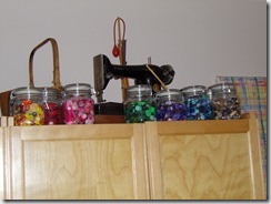
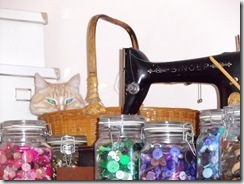
Looking up to the top of my large wooden storage cupboard is the rainbow of button jars. I inherited several button jars from relatives and decided to display the buttons in canning jars. There are 10 jars, each with a different colour of buttons, large and small tumbled together. (The larger jar of pearl buttons is stored elsewhere.) Each jar has its own colour from the lightest pastel tints to intense dark shades of the colour; some shiny buttons glint out from the jars. The jars contrast with the shiny, smooth black surface of the old Singer sewing machine (beside Chester’s basket!). The curtains and machine covers are made from a fabric printed in a rainbow “plaid”. This is to remind me that I need to use all the colours, not just blue! No one colour is more important than the other.
IMGP2353IMGP2365

My work table is a wooden structure built by my husband. It is covered in a matte white arborite. However, most days the green Olfa cutting mats are in place and what I see is the green of the mats. It is a medium or mid green, much like grass in the late spring. There is a yellow grid on the surface. In order to do the next exercise with the torn paper pieces, I had to cover the mats with a white board so the green did not interfere with the colours that I was seeing.

The brown in my studio is the woven baskets and the ash wood used to build the cabinets and cupboard door fronts and the table legs. The wood is ash, a very pale yellowy brown colour with slightly darker gain markings. The baskets are various shades of darker brown, filled with yarns and balls of fleece in a rainbow of colours.

I don’t like to live in a space that has white or beige walls. To me, I need colour on my walls to feel at home, warm and comfortable. In fact, my mother-in-law has been known to say about my house “what colour of blue is that room?” My bedroom and two bathrooms are blue and white. I do understand the need for a white space when designing, but I need to live with colour. My husband is red/green “colour challenged” (as he calls it) so sometimes we have interesting discussions! I have had to tell him whereabouts on a wall he finished painting as he cannot see a subtle colour difference between dry paint and wet paint or the under wall colour of beige. This “challenge” was a good check for me when I was doing the tonal value colour exercise as he doesn’t see the colour, just the values.

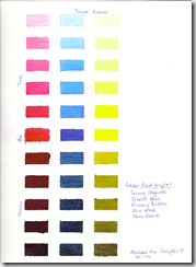
2. Organizing Colour: Colour pages

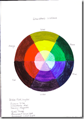
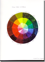
When I did this exercise, I decided that – at the same time – I should complete a similar exercise that I was supposed to have finished many years ago. I used my extra cut papers to create a colour wheel in a larger sketch book.  (large sketch book on left and sketch book  for thison right)
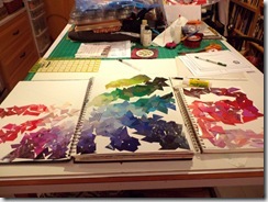
IMGP2304

For the colour wheel exercise, I divided the colours up into 12 separate colours and arranged the pieces from dark to light in the center. For this course I divided the colours into only 6. So my green page goes from yellow-green to blue green and I arranged it in value from dark to light. All 6 of my colour pages are arranged in the same manner.

I tend to like the cool colours and tints of colours best. My impressions of the six colour pages are listed below.

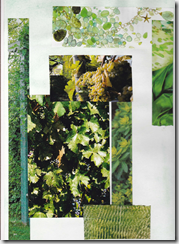
Green
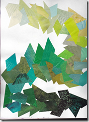
imageimage


*invokes impressions of nature & freshness – green growth in the spring, coolness of the forest

*tends to be a calm colour for me

*lots of variations of green papers available to use

*not my favourite colour to stitch – always seems so much greenery in a project to stitch and I leave it till the end!

*Christmas

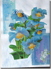
Blue
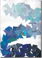
imageimage

*my favourite colour to wear and live with

*calmness, serenity

*the horizon on water, the sky, the mountains (I was born in the Rocky Mountains)

*winter cold

*lots of blues available, more of the darker tonal values

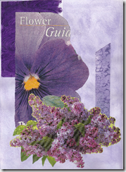
Violet
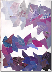
imageimage

*royalty, mystery, mourning,

*mauve, lavender and lilac – spring like, the colours of my favourite flowers and scents

*Easter (with yellow)

*lots of car ads had blue-violet as their background colour

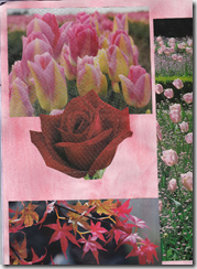
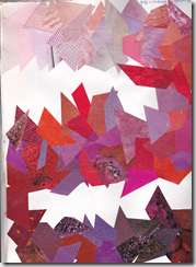
Red
imageimage

*action – energy, exciting, heat, fire

*I like pinks and burgundy rather than intense red. I have bought red shoes in the past two years – very different for me! A little touch here and there does it for me.

*Christmas

*Valentines, hearts- pink to burgundy

*many of the ads used an intense pure red, so there are more samples from mid tone red

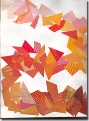
Orange
imageimage

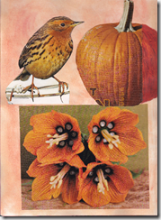
*Halloween – pumpkins, squash

*fire flames, warmth, spicy

*I avoid orange – most oranges do not look good with my skin.

* Again, many ads used intense orange or red-orange and it was hard to distinguish from red, especially if working at night. A fair amount of yellow-orange available. Red-oranges supplemented with painted papers.

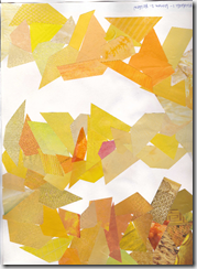
Yellow
imageimage

*This is my least favourite colour to wear or work with: it makes me look jaundiced.

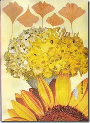
*sunshine, moonlight, daffodils, and marigolds – little touches work well.

*autumn leaves

*gold – richness, luxury

*Yellows in the ads often faded or moved to yellowy browns & beiges in ads. Supplemented with some painted papers

3. Collecting Colour.

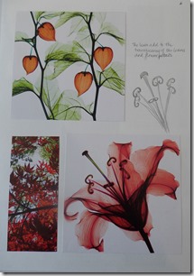
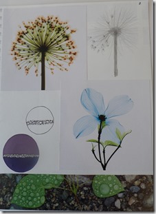
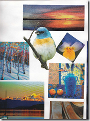
a. For my colour pages/picture gallery, I chose flowers or greenery to showcase each of the 6 colours. I like to garden, especially flowers in the summer. I added words to how colours make me feel in the organizing section above.

One colour scheme I like to work in is orange and blue, specifically using blue-green and more coppery shades. I have added one page of orange and blue combinations.
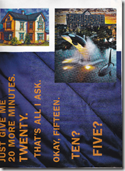
imageimage

I have other notebooks/sketchbooks of inspirations – collections of trees, sea and sky, flowers, shells, hearts, rocks, circles. I have started to organize my photo files on my computer into design ideas – flowers, pumpkins, lines, etc.

c. Primary colours:

The primary colours- red, yellow and blue – make me think of young children. These colours are often used for children’s toys; they are bright and eye catching and seem to be used in equal amounts. You will also see the 3 primary colours – in their full strength or intensity – used in advertising pictures and labels. I think this is to create an eye catching advertisement.

In collecting pictures of red-yellow- blue, I realize that much of what I have collected is not the pure primaries. It is red-orange, yellow-orange and varying values of blue. I find the complementary combination of blue and orange much more pleasing than the intense primaries. And when does orange become red? Or become yellow?

The primary colours are too intense for me. I prefer to have blue – in any tonal value with just accents of red and even less accent of yellow. Or I like to mix navy blue with pinks. I don’t like to draw attention to myself with bright red or yellow.

Using the primaries in stitch: I would tend to use the red and yellow as accents with blue as the predominate colour. Or I would work from red-violet to violet to blue with perhaps an accent of yellow.
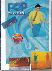
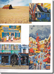
imageimage

d. I think one of the linking features of the six pictures is the fact that each features curved lines. The objects in the photos are organic, not rigid geometric designs. The colours are bright, not subtle.

Have you read Victoria Findlay’s “Colour – Travels through the Paintbox”? Her book tells the history and origins of the natural colours we use. It is a fascinating read. Right now, I am reading “Mauve” by Simon Garfield. It tells the story of “how one man invented a colour that changed the world” – the work of William Perkin who invented the first aniline dye for mauve. It is a fascinating look at chemistry in the 19th century.

4.Transfer paint

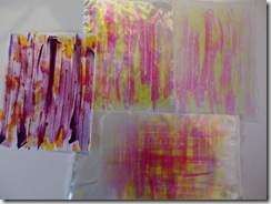
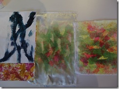
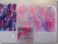
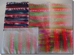
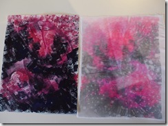
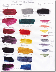
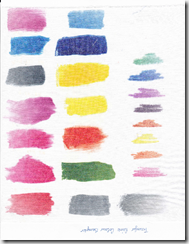
We used two brands of transfer paints from our stash. I have the “Embroidery Adventures” brand that I purchased in the USA and Diana had some G&S Dye transfer paints. I also had a set of the Crayola fabric crayons that is on the sample page. I did not make a whole transfer using these – just this test one.

We made a colour chart of the colours before painting our pages. I ironed mine onto polyester/cotton broadcloth.
imageimage

The colour chart and sample

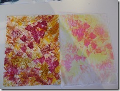
Transfer painting is not my favourite way to apply colour. It is a relatively fast and painless way, but the results are unpredictable. I find it difficult to think in reverse by putting the colour I want on top down first. I usually end up with it backwards. And the colours when you paint are so different from the results. I mainly used a foam sponge brush and a paint brush to apply the paint. I found myself making patterns when painting the papers.

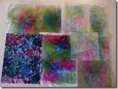
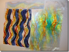
The results were certainly more interesting when you over stamped the papers and combined the different patterns.

I liked the results of printing on the bridal satin more so than on the flat surface crepe and even weave fabrics, and found I was using the satin more for the transfers. The bridal satin fabric continued to give good colouring even after using the transfer papers several times.

The two crushed velvet samples I made have great results, but now they are too precious to use!

The polyester/cotton broadcloth gave very pale colours even with the first or second transfer.

I also tried a transfer onto cream coloured acrylic felt. It was one of the transfers I had used several times, but the colour results are interesting.

The photos below show the transfer paper with the sample fabrics I used. I have noted on the back of each transfer paper what fabrics and number of “printings” that I made of each.
IMGP3135IMGP3137


IMGP3139IMGP3140


IMGP3141IMGP3142


IMGP3143IMGP3145

**********************************************************************

I taught fashion studies in high school, so I have included my notes on colour descriptors, colour expressions and emotions or moods of colours from that course.

Colour Notes: Symbolism, Word Associations, Emotions and Phrases

Yellow:

Sunshine – cheerfulness, happiness, optimistic

Warmth, radiance,

Energy, chaos, life force

Wisdom and learning, spiritual enlightenment

Spring freshness, growth – yellow-green is first growth

Autumn leaves – golds and yellow-browns

Lemons, squashes

Cowardice,-treachery, betrayal, greed (avarice), dishonest, egocentric

Jaundiced

School buses

Mellow yellow

Yellow pages (of phone book)

“Yellow with age”

“Yellow peril”

“Yellow bellied”

You are “yellow” – meaning you are chicken – too frightened to do something

Gold

Expensive, luxury, richness

“Good as gold”

“Gold digger”, “gold bricker”

“Golden age”

“Voice of pure gold”

“Golden girl”

Orange

Hottest colour on the colour wheel –
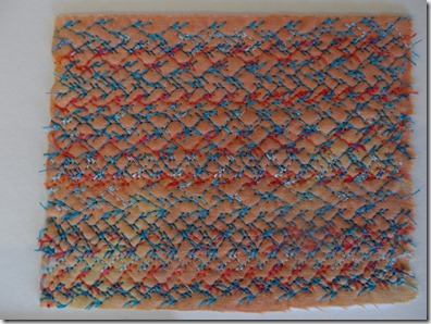
Alert, CAUTION, warning – highly visible colour + safety vests, prisoners’ uniforms

Exuberance, love, happiness

Fire, flames, volcanoes, warmth

Rust – terra cotta- aged

Pumpkins, squashes, peppers, oranges, turmeric, curry powder

Harvest moon

Copper,

Peach

Sunsets

Saffron robes of the Tibetan monks

“Orangeman” (Irish)

“Carrot top” (red head)

“Ginger cat”

“Peachy keen”

“Orange alert” – terrorism alert
Red

Hot, fire, flames, STOP

Energy, exciting, passionate, danger, spicy, joy

Blood, embarrassment – blushes

Red Cross – first aid

Anger, passion, rage

Love, hearts, lust, fertility

Devil, evil
Richness, wealth

Christmas

Accent colour – scarves, lipstick, shoes, red heels

Cardinals’ robes

Chinese culture – bridal robes, good luck
“Seeing red”

“hot Stuff”, “Hot tamale”

“Red light district”

“Blood red”, “red blooded”

“In the red” – losing money

“Red neck”

“Red handed”

“Red herring”

“Red tape” – bureaucracy

“Red party” – communist party– “red square”,” pinko commie”

Politically – Liberal party (NDP in Canada) – red Whigs

“Scarlet letter”, “scarlet woman”

Red hat society – red and purple or pink and mauve

Pink

Sweetness, tenderness, softness

Youthful, feminine

“Tickled pink”

Violet (Purple) – lavender, eggplant, lilac, mauve, plum,

Royalty, regal, dignified, imperial, pomp, pride

Justice, intelligence, knowledge

Richness, expensive

Mystery, cool

Cruel, pompous

Strong, potent, intense, passion

Mourning, grief, sorrow, nostalgia, old age, purple ribbons – memorial wreaths

Christian faith – Advent, Easter

Grapes, wine

Magic – purple cape

Bruises

Purple haze

Flowers – wisteria, iris, lilac, lavender, petunias, pansies, plums and prunes

“Shrinking violet” – shy

“Purple prose”, purple language

“Purple Heart” award for bravery

“Purple with rage”

Red hat society – red and purple or pink and mauve for younger members

Blue

Cold, cool, somber,

Calm, relaxing, serenity, peace, comfortable, secure

Landscape – water, sky, depth,

Sadness, melancholy, depressing,

Indigo – jeans

Navy – uniforms, overcoats, authority

Spirituality, intellect, truth, sincerity,

Safe colour for clothing

Masculine – boy’s colour

Politically – Conservative party in UK and Canada, Republican in USA – blue torries

“Feeling blue”

“Blue blood” – royal/ upper class

“Blue stocking” – intellectual woman

“True blue”

“Blue with cold”

“Blue funk”

“Blue Ribbon” prize – the best!

“Blue moon”

“Blue in the face”

“I’ve got the blues”

Green

Nature, grass, new growth, trees, verdant, lush, re-growth, life and death, hope, eternal life, resurrection,

Spring, fresh, refreshing, youthful

Calm, cool, peaceful

Christmas

Money – “greenbacks”, prosperity

Envy, jealousy

Drab – olive green

Sour (fruit) –

“Green” – not ripe or uncured, unsmoked

“Green wood” – uncured wood

“Greenhorn” – inexperienced, Immaturity

“Green around the gills” -off colour

“Going green” – recycling

Green Peace organization

“Green with envy”

“Green as grass”

“Green room” – theatre term – room offstage

“Green Thumb”

“Grass is always greener on the other side”

White

Purity, angels, innocence, chastity, holiness,

Ghosts, Emptiness, void,

Cleanliness,

Snow, ice cold, clouds, steam,

Virginal, light, air, birth, puberty, confirmation

Bridal wear – western world

“White out”

“Dead White” – no life, flat

“White light” – clarity, enlightenment

“Turn white”, “white as a sheet or ghost”– shock, fright, fainting,

“White knight” – savior, rescue, goodness

“White house” – USA

“White tie affair”

“White hot”

Black

Death, mourning – black armbands, black clothing for widows,

Somber, formal, terminal

Black robes – judges, university robes

Goth

Bohemian, artsy,

Evil, sinister, left, disaster

Bad luck -“black cat”

“Black hole” – empty, void,

”Black Magic” – witches on Halloween

“Black hat – bad guy (good cowboys always wear white hats)

“Black tie” – formal affair, sophisticated, “Little Black dress – LBD” – sexy

“Basic Black” – standard wear

“Black Diamond runs” – difficult ski runs

Feeling “black” – depression

“Blackout” – lack of light

Grey

Neutral, colourless

Mourning

Depression, dreary

Anonymity

Humility, peaceful, secure

Silver

Moonlight

“Silver lining”

“Silver tongue” – glib

“Fast as a silver bullet”

Brown

Earthy

Dependable, realistic

Spiritual death, penitence

Boring

“Brown out” – power/el